Want more Useful photography tips? Click here!
Creating more lifelike colors in Adobe Lightroom is really, really simple once you identify and pay attention to specific areas in your images. Best of all–it’s a process that works with every image 100% of the time.
The process goes like this:
– Look at the image and figure out if you want it to be brighter or darker. You absolutely must go one way or the other even if it’s 1/3rd of a stop.
– Slightly raise the contrast and clarify a few points, no more than 10 each.
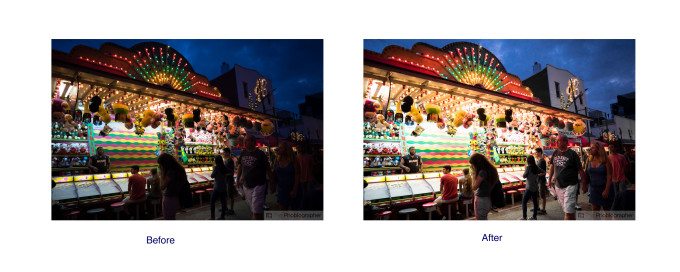
– Move down immediately to the color channels and identify the most important colors in your scene. For the image above it was red, blue, purple, green, and orange.
– Start by working with the saturation levels of each of your paramount colors. Move the slider back and forth until you get the colors to be exactly how you want them to be. Saturation makes colors more or less punchy.
– Once you’ve done this, tweak each of the colors that you manipulated with the luminance bars. This makes them brighter or darker individually.
– Finally, tweak your white balance providing that the balance isn’t terribly out of the norm. If it’s out of the norm, then do this way before you even really begin editing the image. What you’ll find is that generally you’ll only need to change the white balance just a tad.
And that’s it, you’re done. For the image above we raised the exposure, did the contrast/clarity tweaks, saturated pretty much all of the colors except for purple, and we also individually raised each color a bit more to add even more punch and impact to the scene. The great this is that this works for every photo; but in general it’s worth it to figure out what colors Lightroom believes each section to be. Once you’ve got this you’ll be able to create better color every time.


