Last Updated on 07/09/2015 by Chris Gampat
All images by Bartholot and Serial Cut. Used with permission.
In the professional world, it’s not uncommon for photographers to collaborate with other artists in order to create products or satisfy what a client wants. So Bartholot and Serial Cut worked together to produce a series of portraits for the OFFF art festival. Serial Cut has quite the client list ranging from Absolut, Adobe, AT&T, BlackBerry, Burger King, all the way to Volkswagen.
Run by Sergio del Puerto, he tells us about how the idea for Unmasked: Demiurges came about.
Phoblographer: How did you guys get into photography?

Sergio: The SC style has always been photographic, aside we sometimes use CGI in some of our artwork. The final works always have this defined, sleek, crisp look. Bartholot has a background in the History of Art and Graphic Design, but he wasn’t really happy with it. Then he had the opportunity to play with photography as an assistant. It took him a little while to start shooting for himself, but when he finally start playing with it, it really made him happy and starting working in more and more projects and build his own style.
Phoblographer: Where did the idea and inspiration for this project come from?
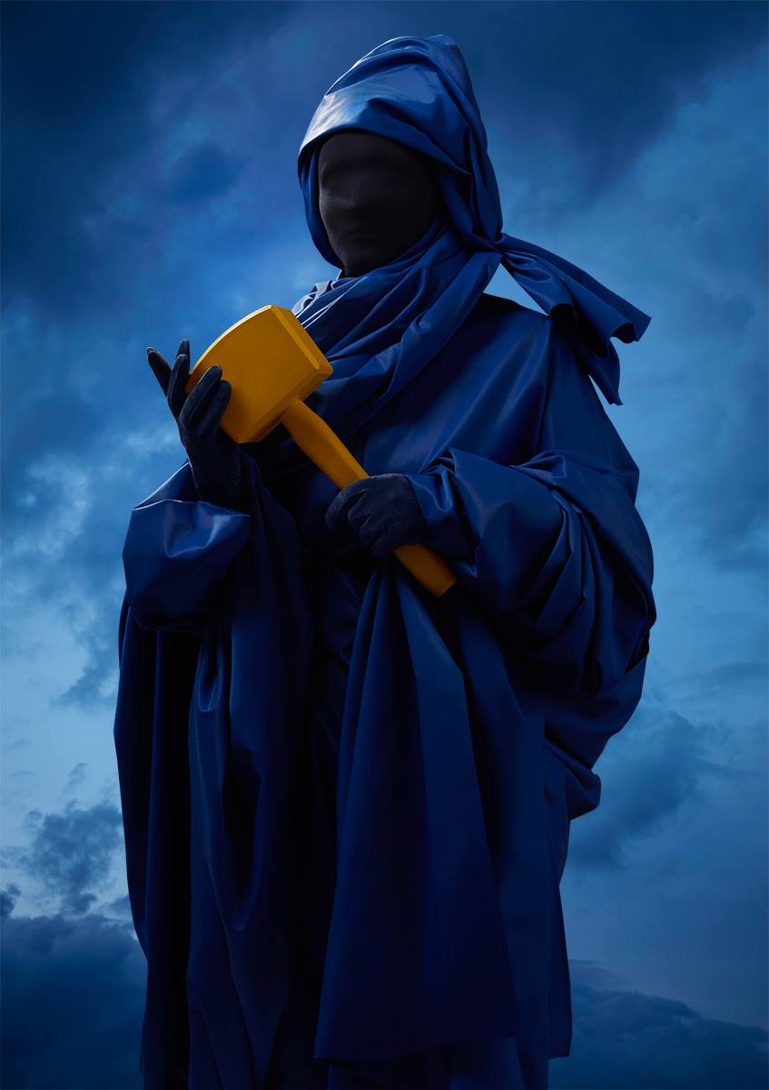
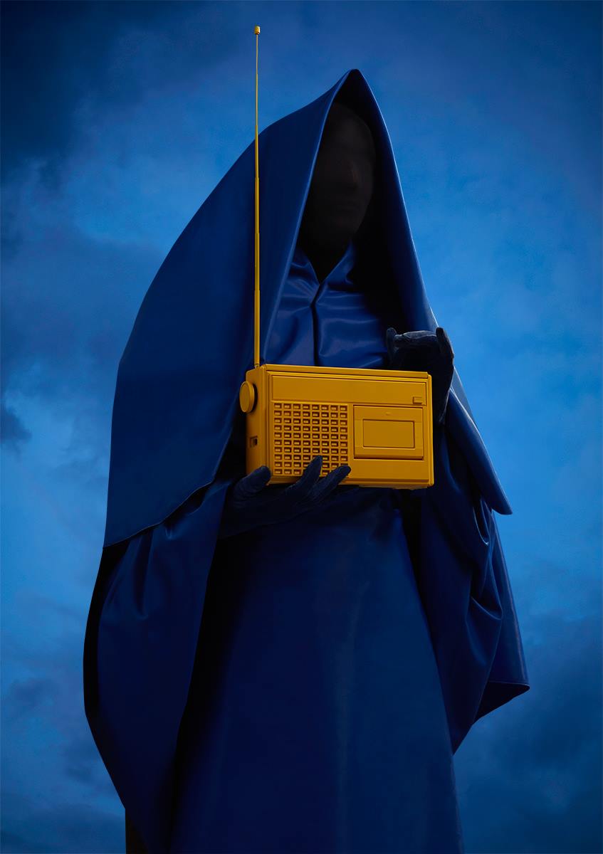
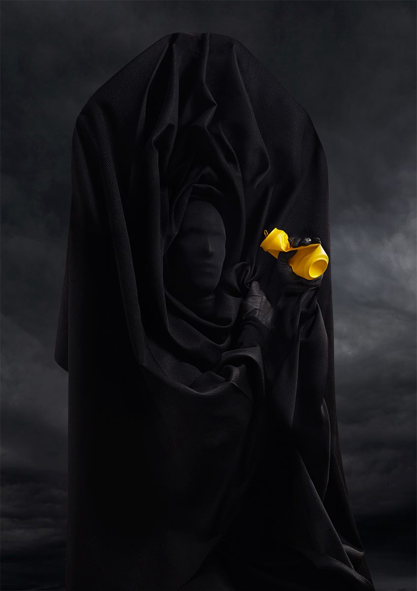
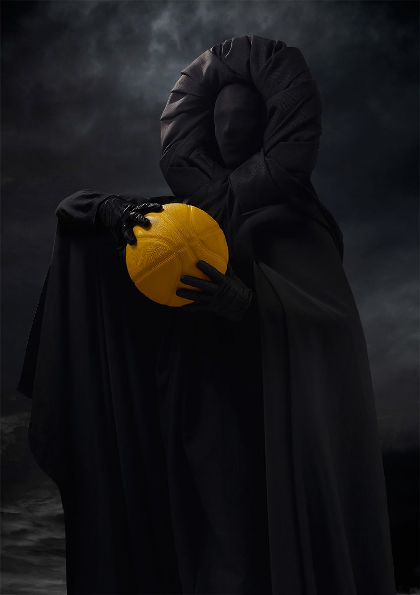
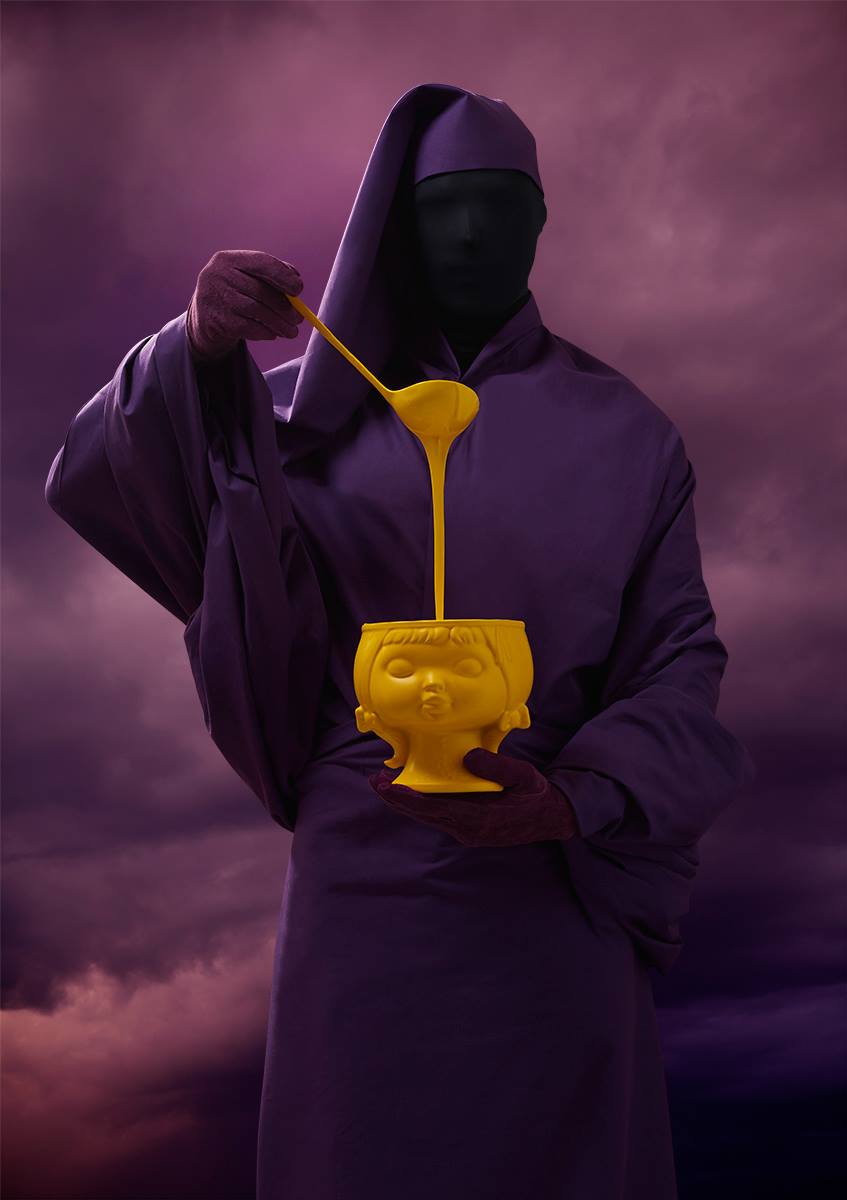
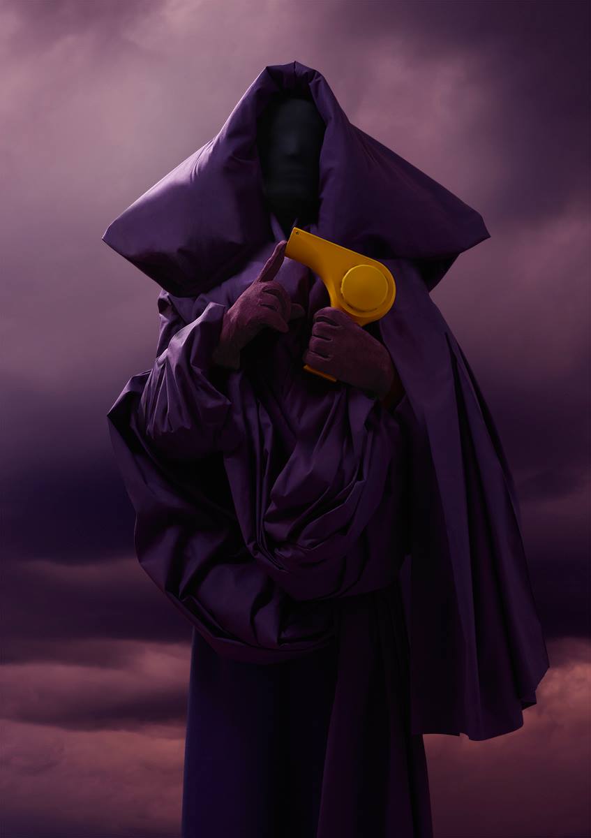
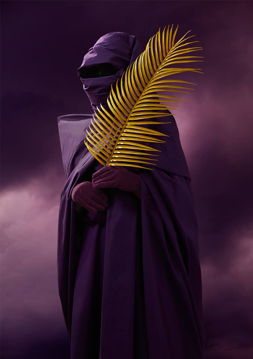
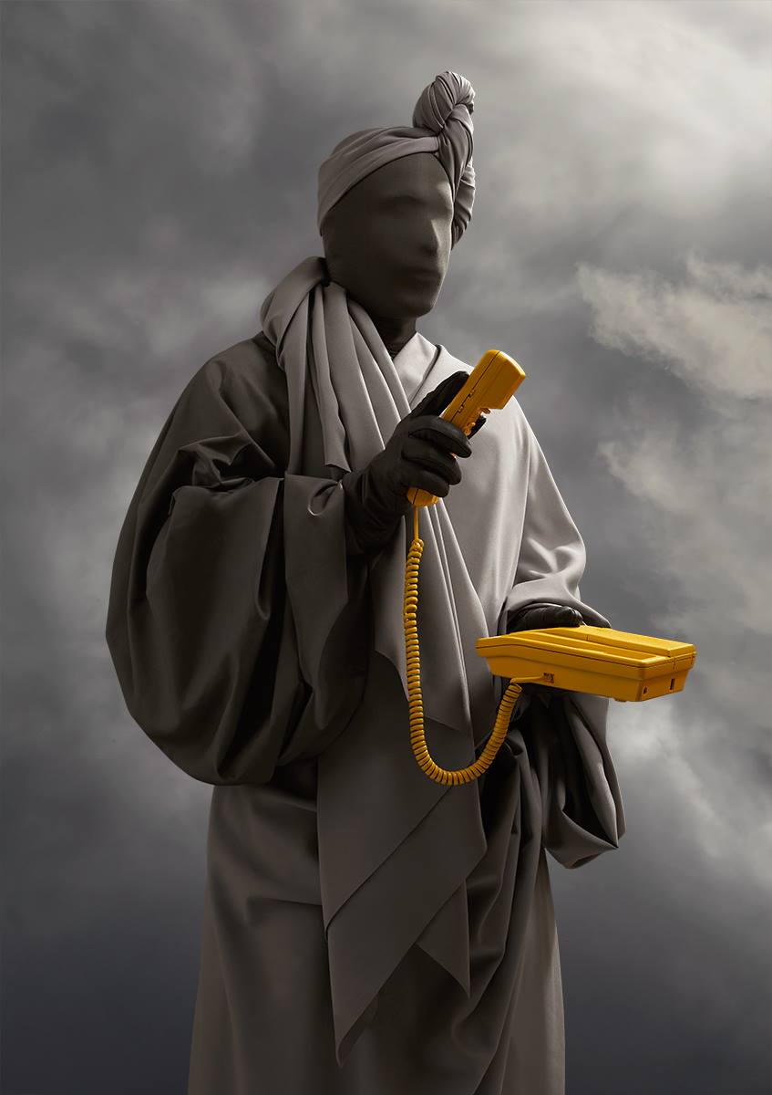
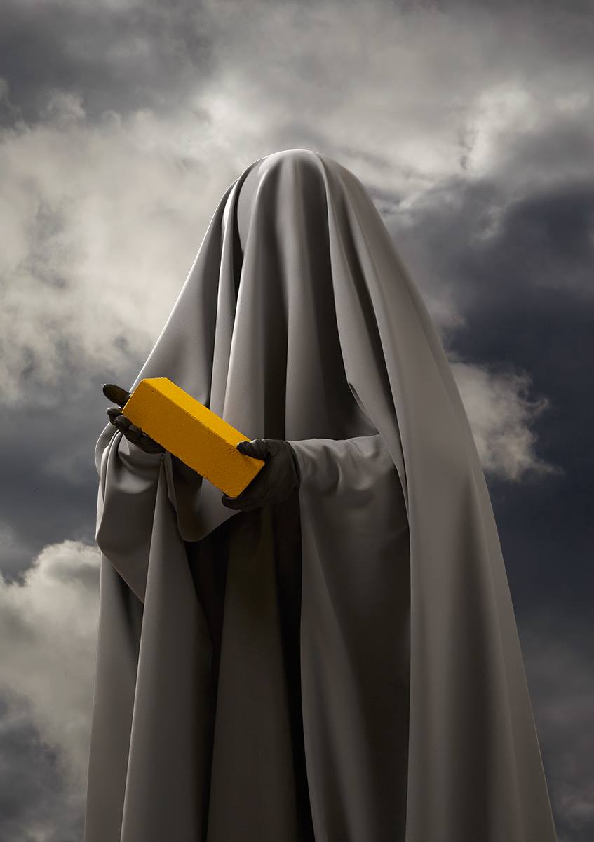
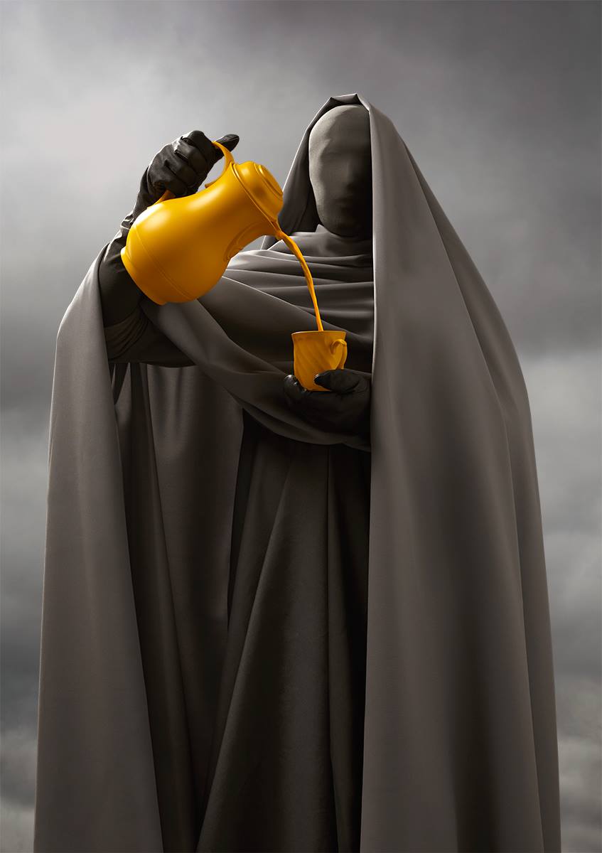
Sergio: Spanish design studio Vasava approached us asking for 12 portraits to be published in an art book celebrating the 15th anniversary of the OFFF festival. They asked for anonymous demiurges representing some of the most influential contemporary designers that have been assisting to OFFF festival over the curse of time. So we came up with the idea of going back to the roots and putting tights on the model’s faces and cover their bodies with some interesting drapings. So actually we were inspired by ourselves.
Phoblographer: Every photographer tries to say something in their images in order to creatively express themselves. What are you guys saying in these images?
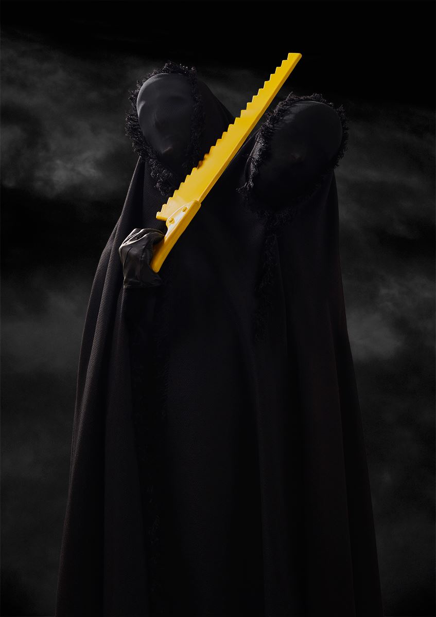
Sergio: Our main interest was to express a dark and esoteric atmosphere without being too serious. The acting and the yellow everyday life objects help to get that ironic feeling. They would be too dramatic without these props. Is part of the SC style: a mix of something iconic, pop and surrealistic.
Phoblographer: Why was there so much matching involved with the skies and the outfits? Why the color contrasts?
Sergio: In order to achieve a certain “religious“ aesthetic it was very helpful to use this special colour pallette as well as to involve a lot of colour matching. The random yellow contrasting objects were necessary to break the atmosphere and to add an ironic and fun element in the series. Bartholot also shot the skies in the south of Germany, so the contrast work really well as a typical paint backgrounds from XIX century paintings.
Phoblographer: How did you explain these concepts to the models? Was there storyboarding involved?
Sergio: Before the shooting we were preparing elaborate sketches for each portrait to help. However, when shooting we had to move the models like dolls as they were almost blind and pretty focused on not fainting for the lack of air. We always work with some basic sketches, that helps so much during the process.
Phoblographer: Why were the specific objects in the scenes picked?
Sergio: Each character needed an identity through these objects. At the moment of making these portraits, we didn’t know the designer names related with each one. By adding these generic objects, any name would work perfectly with any name.
Get rid of the ads!
Did you enjoy reading this article as much as we enjoyed writing it? There's a way to support us and our reporting, getting ad-free navigation and more as a bonus. Subscribe to us for less than a coffee per month —just $3.99— or take advantage of our yearly subscription with a hefty discount for only $25.- An ad-free experience
- A free mystery box for Lightroom or Capture One
- All the books in our store
- 20% discount on Capture One
- 30% discount on Imalume Photo Theft Protection
- 20% off Herbs and Kettle Tea Company.