Creating the Photograph is an original series where we interview photographers about a photo that they shot and how it was achieved. The results are some knowledge passed on to you. Want to be featured? Email chrisgampat[at]thephoblographer[dot]com.
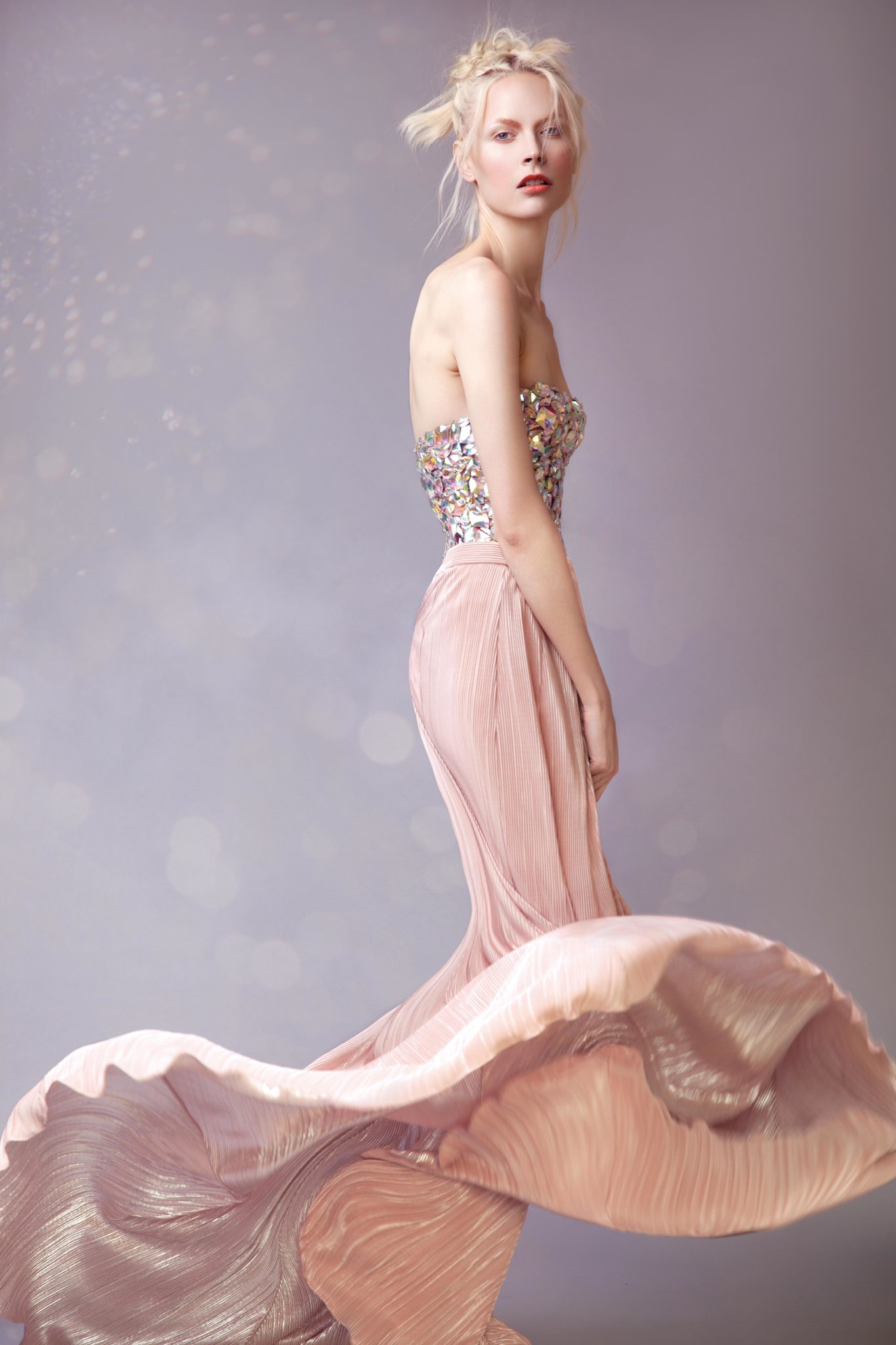
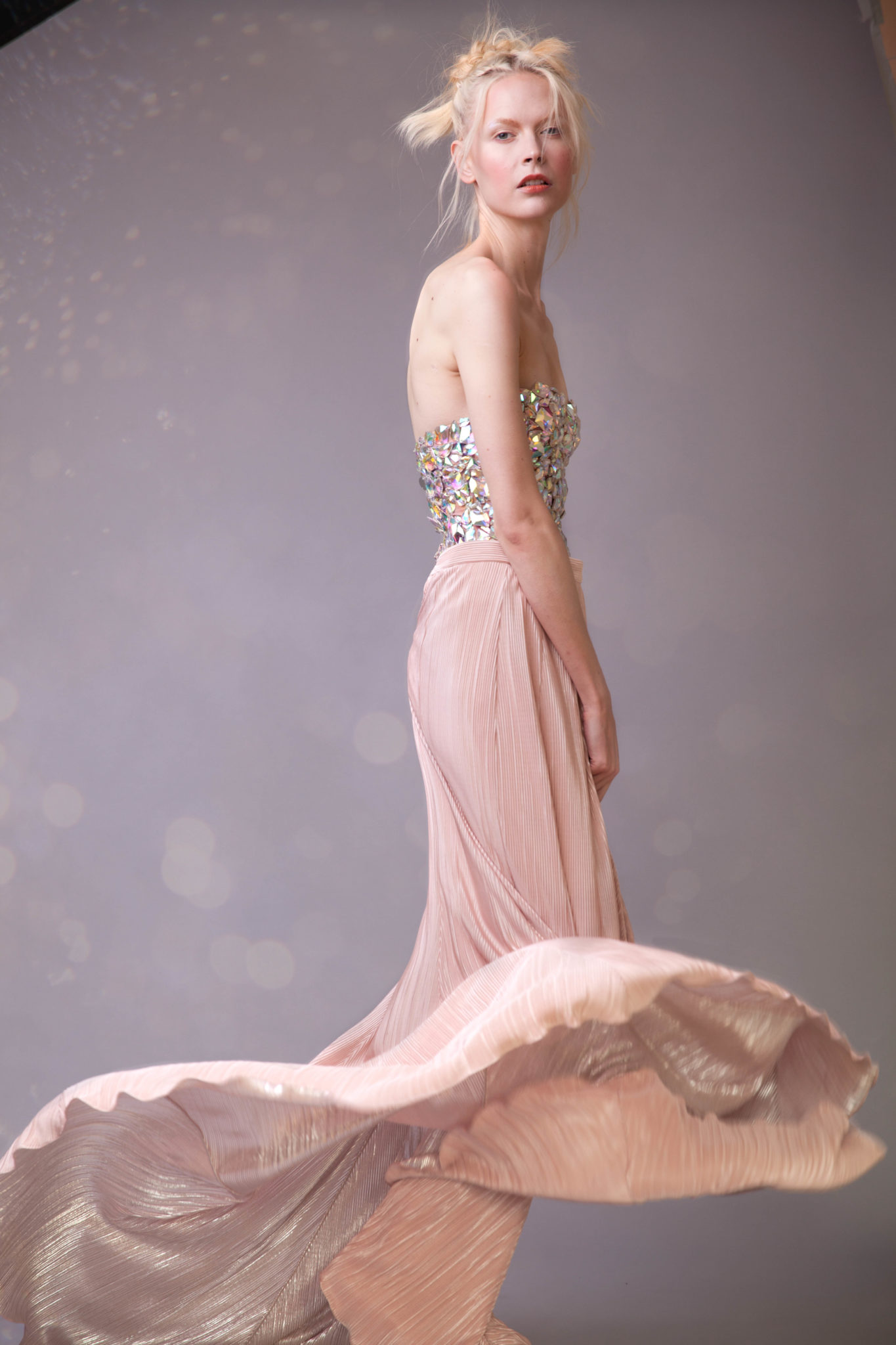
Rossella Vanon is a photographer based in London and who recently caught our eye when she was featured on the Profoto Blog. Ms. Vanon is an editorial photographer that has worked with some very amazing clients. Her work is beautiful and reminds us a lot of something that Annie Leibovitz might create or shoot. Her recent work for Nylon Mexico yielded the Pale Grace photo that we see above.
And here’s Rossella’s story about the image.
The Concept
This image is part of a fashion editorial I shot for Nylon Mexico magazine in November last year, published in March 2014.
The main idea behind the shoot was to represent the woman as a feminine and soft creature, and from a fashion point of view I decided to base the styling on pastel colours. The colour scheme also helped me enhance the overall delicate and soft mood of the shoot.
Pastel colours had just been announced as a major fashion trend for spring/summer 2014, which made the styling decision even more interesting and relevant. Being the shoot meant for a fashion magazine, this was an important consideration to make beforehand: would the choice of wardrobe (including style, colours and brands) satisfy the current fashion editorial needs?
The model was also chosen to fit the theme perfectly. As usual I received many models suggestions from London-based modelling agencies to choose from, but my eye was set on Henna from the very moment the mainboard women booker at Storm showed me her card.
By the time the theme and styling come together before a shoot I already have a clear idea of what type of model I would love to work with for the project, and often I do find a beautiful face that matches the one in my imagination.
The Gear
– Canon 5D Mark II
– Canon 24-70mm F2.8 L II lens.
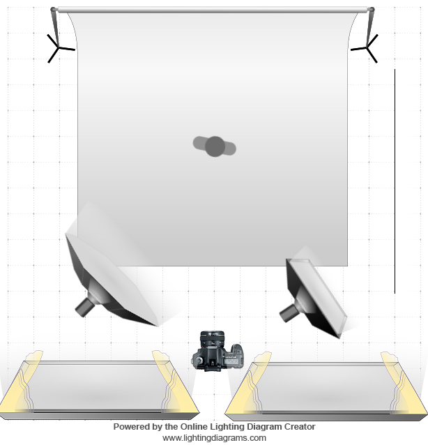
– The lighting consisted of natural lighting coming into the studio from big windows opposite the set, a big Octabox and medium Softbox, on two studio strobes.
The Shoot
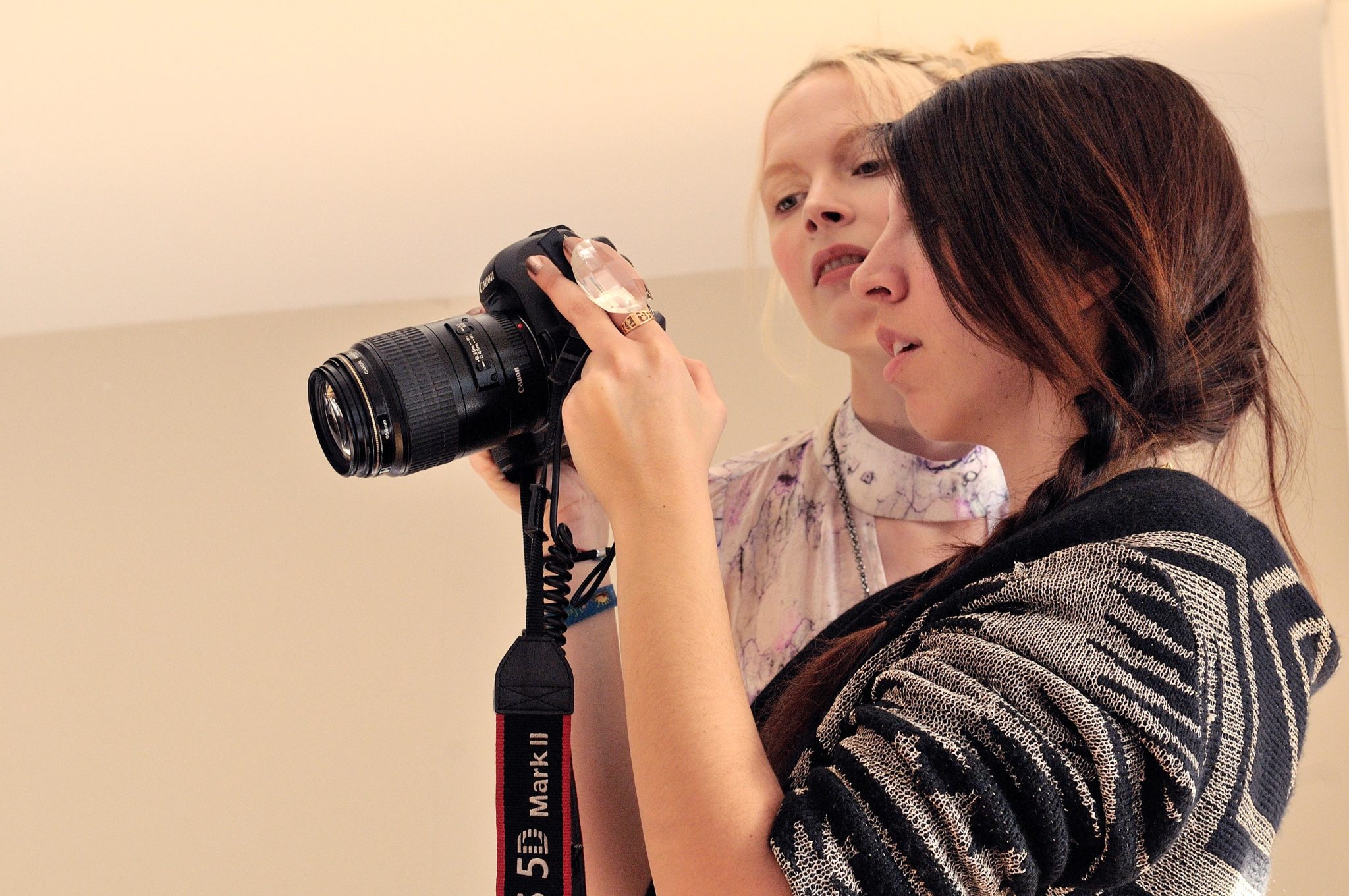
Everyone in the team was a very skilled and trusted creative I had successfully worked with before. When I put the team together I already knew we would create something that we would be proud of and at the same time have a great, fun day doing our favourite job. We all understood each other’s vision straightaway and everybody’s suggestions simply added more and more value to the story, making the day run extremely smoothly.
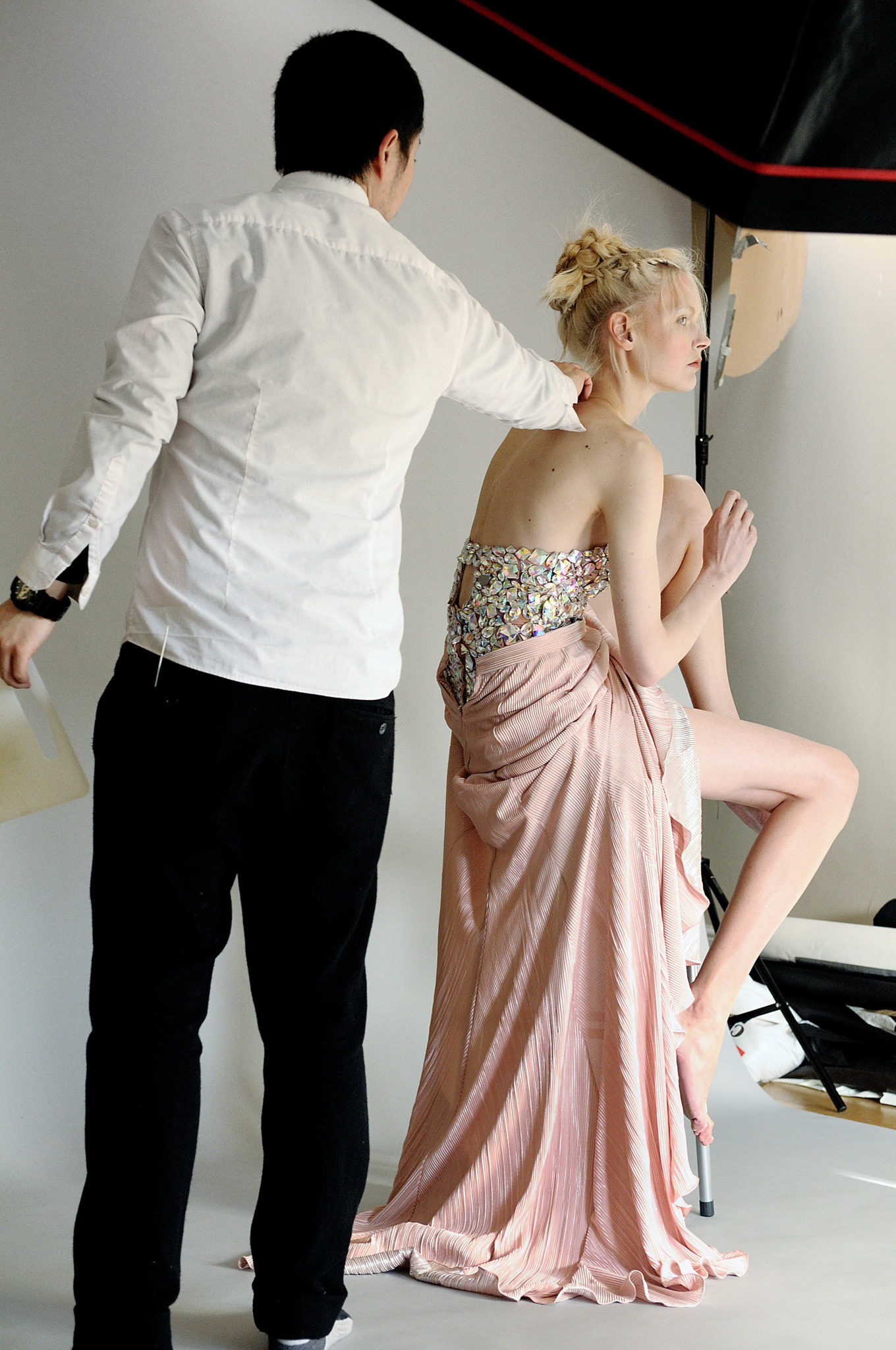
We shot eight outfits and it was a pretty intense and full on day, as usual.
At a certain time in the day the sunlight was shining hard and right through the studio windows. By chance we noticed that the light was hitting a garment that was part of our wardrobe. It was a beautiful corset embellished with clear stones, similar to the one the model is wearing in this image, and it was reflecting the light in a rainbow of small highlights all across the opposite wall.
The result was so beautiful I just couldn’t resist. I asked my assistant Natasha to sit close to the window and kindly hold the corset up for me as it if were a reflector, trying to catch the light from the sun and reflecting it back onto the set. In a second the beautiful highlights were all over the model and the background, sparkling and shivering at every single tiny movement as if they were alive.
I asked the model to move and throw the end of the long dress she was wearing, to add movement to the picture. I wanted to create a beautiful, interesting shape with the soft fabric of the skirt that would have otherwise fallen straight to the ground.
Since the idea for this project first came to my mind, I imagined shooting this story with natural light. I was after softness in every shape and form.
Spring/summer fashion editorials, however, are usually shot in the winter, and this story was no exception. November was cold and rainy which wasn’t exactly a great starting point for an outdoor whole-day shoot. So I opted for a studio shoot.
At that point, the next step was to develop a lighting setup that would give me the same softness as natural light and create the delicate mood I was after.
First of all I chose a studio space with big windows that allowed plenty of natural light on set. The windows were left open the whole duration of the shoot.
The light was coming in and diffusing all around the room, but it wasn’t strong enough, on set, to allow me to shoot relying on it alone without having to bump my ISO to a very high value and lose quality in my images.
So I decided to back up the natural light by adding extra artificial light sources (two studio strobes) that would simply increase the amount of light on the model and add a little more definition to it without affecting the softness created by the natural light in the first place, and actually enhancing it.
To achieve this effect I had to choose the right diffusers for my lights and place them in the right position. I chose a big Octabox to be my main light and a medium Softbox to be the fill-in light.
The Octabox was placed at 45 degrees around the model’s side, slightly higher than eye level and pointed directly at her, whilst the Softbox was pointed towards a side wall at an angle that would allow it to bounce back onto the model.
The light coming from the Softbox was too strong, even at minimum power, so it had to be pointed away to tone down its effect.
Post-Production
The post-production of this image was very straightforward. Henna already had a beautiful skin so the normally time consuming part of the job was actually relatively fast this time. All the editing was carried out in Photoshop CS5.
First came the cleaning:
1) On the top left and right corners, the visible edges of a light and the end of the background were concealed and smoothed through an easy and quick use of the Clone Stamp tool.
2) I used the Healing tool to remove tiny imperfections here and there and finished off the skin by applying the Dodge & Burn technique to smooth it and enhance highlights.
3) The skin was slightly desaturated to take away some of the pink tones via the Hue & Saturation adjustment.
Then came the more creative part of the editing:
1) The whole picture was slightly brightened and increased in contrast through a subtle use of both Curves and Brightness & Contrast.
2) The background was also brightened separately from the rest of the image, through the use of Brightness & Contrast and masks.
3) Using the Selective Colour adjustment, I enhanced the blue tones in the background to take away some of the reds and therefore make it appear colder. This way the warm tones of the model and dress would stand out against it.
4) Finally, through the use of the Liquify tool, the shape of the dress was subtly enhanced to make it look more tidy and round.
You can follow and check out more from Rossella at her Portfolio, Workshops, Facebook, Twitter, Instagram, or her Youtube.
Before/After
For more, please follow us on Facebook, Google+, Flickr and Twitter.
Get rid of the ads!
Did you enjoy reading this article as much as we enjoyed writing it? There's a way to support us and our reporting, getting ad-free navigation and more as a bonus. Subscribe to us for less than a coffee per month —just $3.99— or take advantage of our yearly subscription with a hefty discount for only $25.- An ad-free experience
- A free mystery box for Lightroom or Capture One
- All the books in our store
- 20% discount on Capture One
- 30% discount on Imalume Photo Theft Protection
- 20% off Herbs and Kettle Tea Company.
- 20% off your order from MPIX printing services.