

Though we create photographs that include color all the time, that doesn’t mean we are always making photographs in which we are using color. The latter means that we are conscious about the presence of color and how it can and will impact our final photographs. Just as painters have learned the importance of the role of color when working with oils or watercolors, we as photographers have to do the same when working with pixels. Here are some recommendations for helping to developing your awareness and use of color.
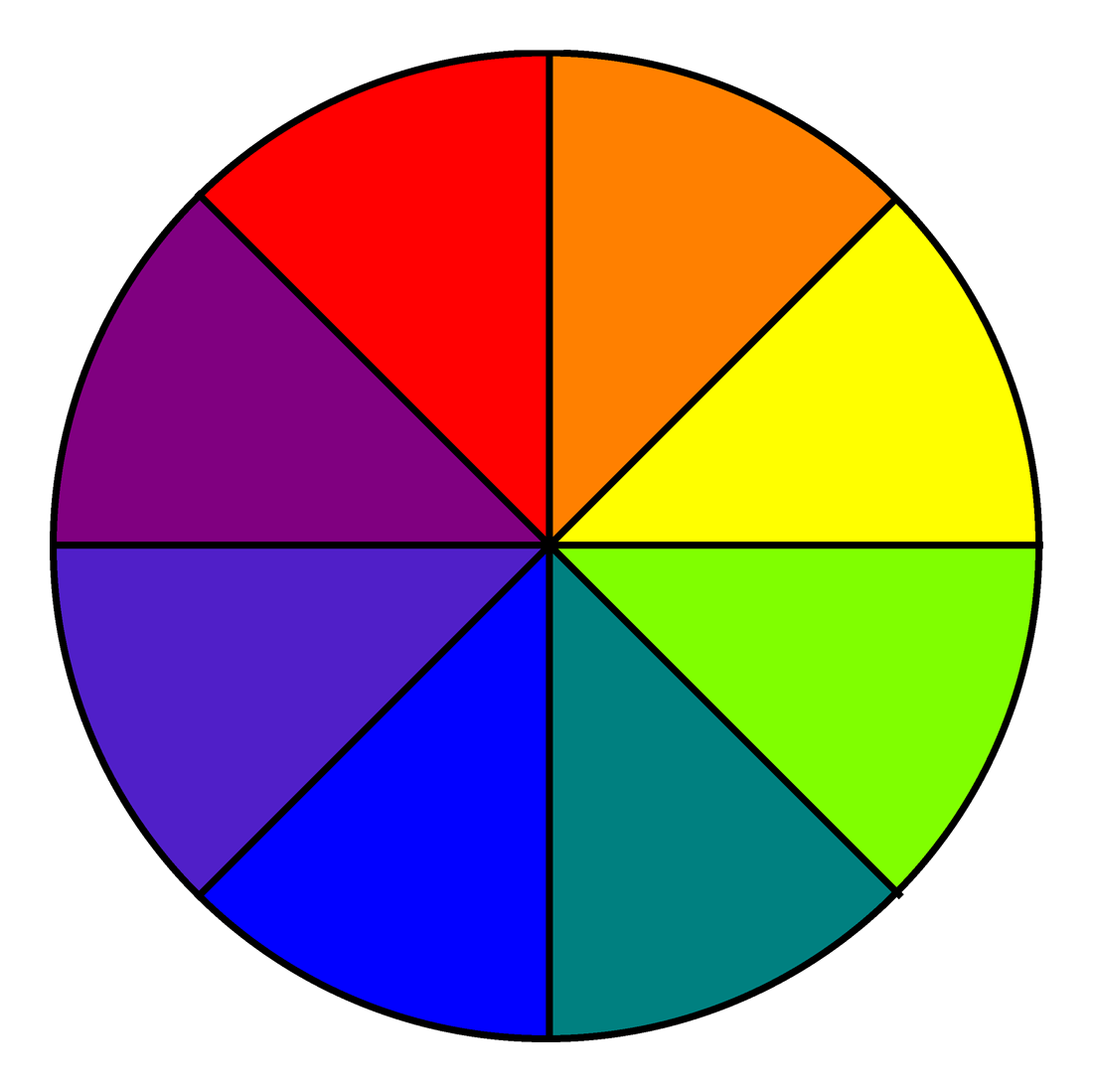
Memorize the Color Wheel
The classic color wheel consists of primary colors (yellow, blue and red) and secondary colors (green, orange and purple). Remembering this and their relationship to each other on the color wheel will help you to use color creatively in your photographs.

Create Images Juxtaposing Primary or Secondary Colors.
When you juxtapose a primary color such as yellow and blue, you create a color contrast that create resonance and energy. It becomes a strong visual draw. You can do the same with contrasting secondary colors as well.
Observe How Color Changes Based on Brightness
The tonal value of a color will change based on brightness. The more light on the color, the lighter it will appear. The less light on the color results in the color appearing darker.
Photograph Colorful Scenes with Different Qualities of Light
You can discover how colors will appear depending on brightness by photographing a colorful subject first under direct sunlight and later in deep shade. You can also make a comparison when part of of the scene or subject is both brightly lit and partially in shade.
Take Advantage of the Direction of Light to Influence Color
If a subject is flat or evenly lit, the color will appear the same. If the color is directional, you will not only see a change in color but also tonality, which helps to create a sense of depth. Create photographs that take advantage of that.

Use Your Camera’s Picture Style to Change the Appearance of Color
The picture style settings of your camera will have a big influence on the appearance of color. A neutral picture style will deliver an image with less saturation and contrast, while the vivid picture style will boost color saturation and contrast. Photograph different scenes using different picture styles and see what you prefer for particular situations. Shoot raw + jpeg to retain your original raw files.

Compose Subjects with Strong Color Saturation
A strong saturated color will draw the viewer’s attention. An element such as a red umbrella will immediately get one’s attention. Take advantage of this by composing photographs where your subject possesses the strongest saturated color.

Avoid Color Distractions
Secondary elements in your photographs especially in the background can become distractions when are the strongest or most saturated color within the composition. Scan the edges of your frame when composing and eliminate such elements from your photographs.


Learn How Colors Appear in Black and White
Develop your eye for how the color world will look in a black and white image. For example, red will appear like a dark tone. Set your camera to raw + jpeg and set your picture style to monochrome. Photograph a variety of colorful scenes and observe how reds, blues, yellows, greens and other colors are rendered in black and white. Use this knowledge to create images with more or less contrast.
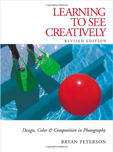
Read Books on Color Theory
There are an abundance of books dedicated to color theory. Though many of these are written for painters, they can be an invaluable resource for improving your color knowledge. If you are interested in a more photo-centric book, you might want to read Learning to See Creatively: Design, Color and Composition in Photography by Bryan Peterson that provides a solid primer for understanding and using color.
For more, please follow us on Facebook, Google+, Flickr and Twitter.
Get rid of the ads!
Did you enjoy reading this article as much as we enjoyed writing it? There's a way to support us and our reporting, getting ad-free navigation and more as a bonus. Subscribe to us for less than a coffee per month —just $3.99— or take advantage of our yearly subscription with a hefty discount for only $25.- An ad-free experience
- A free mystery box for Lightroom or Capture One
- All the books in our store
- 20% discount on Capture One
- 30% discount on Imalume Photo Theft Protection
- 20% off Herbs and Kettle Tea Company.
- 20% off your order from MPIX printing services.
- 5% off Viltrox Products via their eCommerce store.
- 10% off all film developing, printing and scanning services from Blue Moon Camera and Machine
- 15% off 7Artisans products: The lens and accessory maker is offering a sweet discount for Phoblographer's readers.