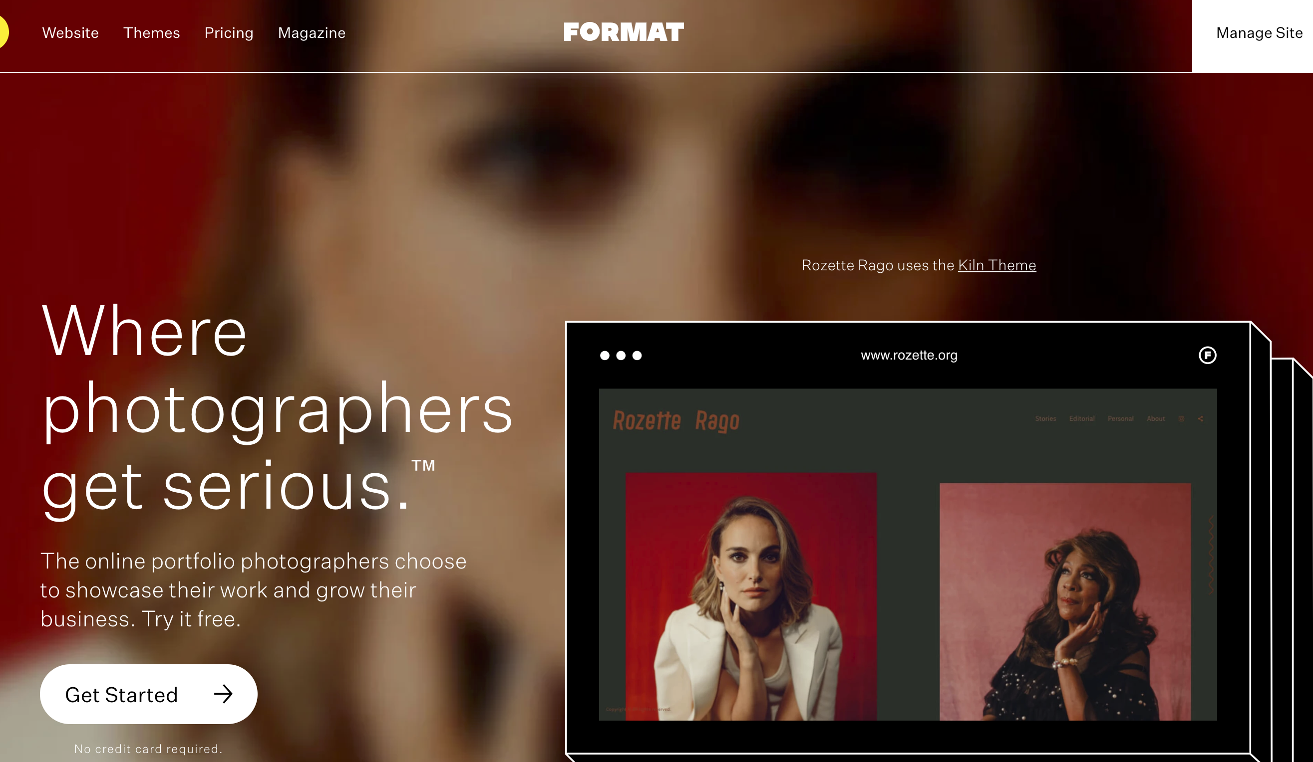
Format has gone through a rebranding in 2020, let’s see what’s new and how you can use it to your advantage.
Unlike the other website building platforms, Format holds the photographer at the center of their core values and vision. As the platform has evolved and the company listens more to photographers on the ground, the features keep getting better and better. But this isn’t a hard sell on their product. Although we will cover what’s new, I’m also going to show you how you can utilize the tools to get the most out of your Format account.
What’s New With Format?
Format prides itself on having a great relationship with photographers. The company ethos is to listen to the needs of those who know best, and that’s the photographers. Format aims the platform to all levels of photographer. However, through the new rebranding, the company is putting a big emphasis on making it more attractive to the professional. Key updates include:
- 65 new ready-to-go templates so busy photographers can build their websites even quicker
- Custom-built portfolios made by Format Experts, for professionals who don’t have enough time to create their own sites
- Mailing list tools to help photographers market themselves and land new clients
- A new membership plan built with photographers’ needs in mind
- An exclusive Photography Business Masterclass to help Format members learn how to grow their business and attain more clients
For me, this biggest take away here is the option of building a mailing list and the offer of an in-house photography business masterclass. Having a mailing list helps to target those that really care. You don’t have to fight with everything else on social media, and you ensure your message gets seen. Of course, getting as much business acumen as possible is crucial if you want to be a successful pro. So although the masterclass should not be your only point of education, it will certainly help.
Using Format For My Website

I recently redesigned my website using Format. The process may seem overwhelming, but because of the platform’s simple, minimalistic layout, it was super easy. Within a few hours, I had a brand new, snazzy website that was more suited to my identity.
If you’re thinking of using Format and unsure how you want your site to look, ask yourself the same two questions I asked myself during the redesign: How do I see myself as creative? How do I want others to see me as a creative?
Make a list of words and phrases that relate to your identity. To peel back the curtain, if I may, I will show what I noted down when I was creating my website.
- Writer
- Photographer
- High-Value
- Trusting
- Modern
- Minimalism
- Well-Traveled
- Authoritative
Turning Words Into a Website

So how do I turn the above words into a website? Well, I know that when people visit my website, I want them to know I’m a writer and photographer. I do that by creating two portfolios, one for my writing and one for my photography. Format allows you to create custom pages for your website. From there, you can select a block that allows you to combine images with text. If you’re a journalist, you can use the image section to upload images from your article and the text section for the article headline, which you have the option of hyperlinking.

As you see from the above image, in a few clicks, I had a clean, informative, clear portfolio where people can access my articles and see more of my work.
As for a photography portfolio, getting the right theme is crucial. I use the Skyline theme. As a photographer that mainly shoots in portrait mode and doesn’t crop out of camera, this theme allows full coverage of my images and displays them in the best way possible. Other themes sometimes crop images in a weird way that do not compliment them in the slightest. Getting this right is down to trial and error. Experiment with different themes and see which one fits with the way you want people to view your photographs.
Get Your Landing Page Right

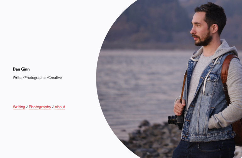
Some photographers like people to get straight to their content when they land on their site. I believe having a solid landing page gives a more professional feel to your website. Landing pages do not need to be over complicated. A few words that tell people what they can expect, a lovely photograph of yourself, and some links to the core pages of your site will suffice. At this point, you’re starting the relationship between you and the person that’s on your site, this is a deal-breaker moment. Do they trust you enough to continue investing their time in your website? If you get it right, they will be more than happy to explore your work some more.
Some Tips
It’s all about the details in our world. Get the slightest thing wrong, and people can instantly lose confidence in you. In your “About” section, for example, if you come across as generic or that you have copied and pasted from elsewhere, it’s going to be difficult for people to invest in you. Get some personality out in this section. Let people see the person behind the camera. Allow them to connect and relate to you.
On the topic of mailing list tools, what part of this means is that you can design a pop-up that you use to encourage people to sign up to your mailing list. So when they’re viewing your photos, eventually, a new screen will emerge asking for their details. You can set a time frame for this to happen. So for example, after someone has been on your site for five seconds, the pop up will come up. Do not set it to pop up straight away. I’ve seen many websites that, as soon as I reach them, I’m already being asked to sign up and give over my personal information – this is very off-putting. As a rule, I would say wait 30 seconds before allowing the pop-up to activate. This gives people enough time to decide if they like what they see and if it’s worth signing up to a newsletter, for example.
The most important tip, in any part of website design, is ensuring your content is up to scratch. Whether you’re a photographer, a writer, a graphic designer, if the quality of your creations is not where it should be, then people won’t want to hang around. Take as much time as you need when selecting what pieces of your work you’re going to put up. There’s no room for “that will do.” It has to be the best of the best, otherwise, you’re wasting your time.
Oh, and one more thing, enjoy it. Don’t lose sleep over creating your website. It’s a lot of fun and fulfilling during the process, and when it’s complete.


