What do you do when you’ve made an uninteresting photo? You could recognize what went wrong and relegate it to the depths of an external hard drive, which would be sensible. Or, you could give it an interesting veneer with some changes in post-production. Turning the contrast to make everything pop, boosting the saturation to an obscene point, darkening the image to deepen the mood: all of these are cheap tricks that can mask an otherwise uninteresting photo. They’re clever devices because your eye catches differences, and the stronger the difference, the quicker your eye will catch it.
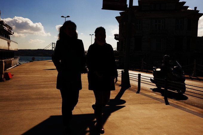
Let’s take the photo above. There are a few things happening to make it look interesting. There’s the warm orangey hue on the ground. The sky has a strong blue that fades. And, perhaps most importantly, the women look like walking shadows. They’re almost an extension of the building and the shadow of the sign post. The truth is that beyond the punchy colors, this photo is very uninteresting. You don’t need a deep knowledge of photography to know that I pushed the contrast slider as far as it could go.
The contrast is striking, and for a quick second, your eyes go, “Woah!” Once the initial hullabaloo quiets down, you realize that the only interesting part of the photo is the intensity of the black, orange and blue. The image is otherwise bankrupt.
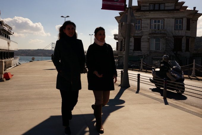
This is the original, even less interesting image.
Unless I had a lighting setup to overpower the sun, there wasn’t any hope to get these ladies properly exposed without blowing out the rest of the image, so I made them shadow ladies. More interesting, yeah? A stylistic overlay to keep you looking at the picture for a couple of seconds longer. It’s a cheap trick, and it’s one that we don’t need because it won’t save mediocrity from itself.
In a recent piece on the Huffington Post, photographer Michael Ernest Sweet penned a damning indictment of the current state of street photography. Given its inherent accessibility, anyone and everyone tries to get in on the action, and as Sweet asserts, everything gets watered down. There’s a great deal of ostensibly bad work, some of which makes the use of cheap tricks, that gets a good degree of social recognition.
It’s all a distraction – whether it’s boosting contrast, hyper saturating colors, colorizing a portion of a monochrome image or anything else – that only serves to compromise the image’s integrity. Content and style should be on an even keel, but if the scales are to tip, content should win out. When style comes before everything else, you’ve got a good looking bad image.
Get rid of the ads!
Did you enjoy reading this article as much as we enjoyed writing it? There's a way to support us and our reporting, getting ad-free navigation and more as a bonus. Subscribe to us for less than a coffee per month —just $3.99— or take advantage of our yearly subscription with a hefty discount for only $25.- An ad-free experience
- A free mystery box for Lightroom or Capture One
- All the books in our store
- 20% discount on Capture One
- 30% discount on Imalume Photo Theft Protection
- 20% off Herbs and Kettle Tea Company.
- 20% off your order from MPIX printing services.
- 5% off Viltrox Products via their eCommerce store.
- 10% off all film developing, printing and scanning services from Blue Moon Camera and Machine
- 15% off 7Artisans products: The lens and accessory maker is offering a sweet discount for Phoblographer's readers.