

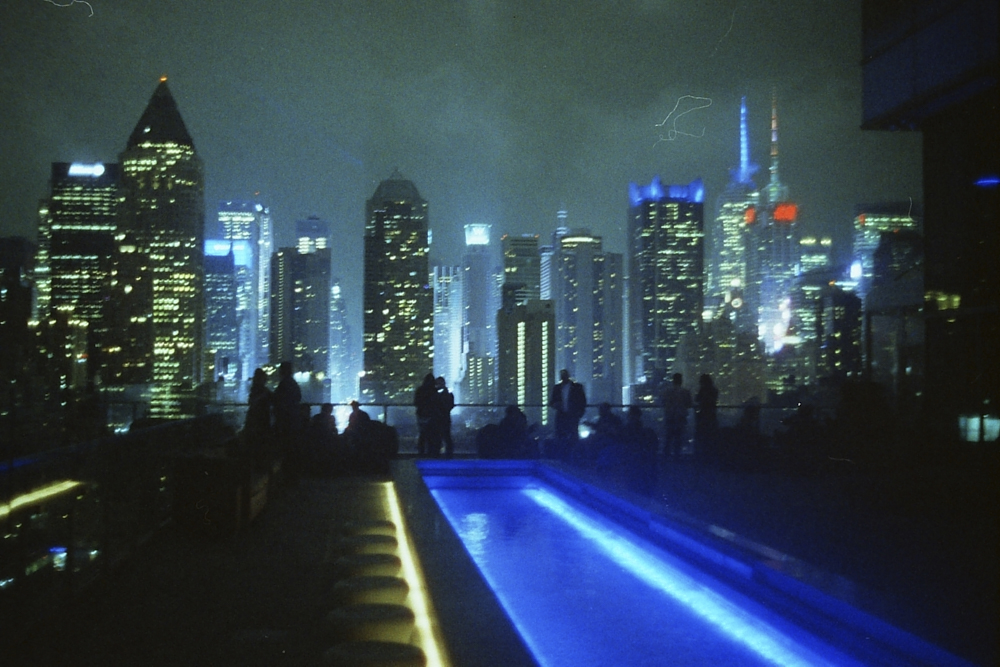
In the early days of photography, people would hand-paint their images to make them resemble reality more closely. However, with the invention of color photos, things changed. It was then that photographers such as Fred Herzog, Saul Leiter, and Neal Slavin began to use color films to document their surroundings, resulting in projects that are now considered iconic. If you’re looking to master the art of color in your photos, here are a few hacks to get you started.
Examine Colors

The first thing one has to do is learn about the colors and color schemes. For instance, color psychology is a great way to understand the impact of certain shades on your mood. London Image Institute has also made a chart, which reveals what yellow, red, or white means. An example is how blue can be associated with trust and peace, while purple means royalty or spirituality. Once you know this, you will know how to evoke certain sentiments. In the image above, the reds and yellows make you feel warm and happy. Look at the works of photographers who utilize colors smartly and let them guide you.
Take Help from Adobe
Adobe Color is a website that offers you a chance to study the color wheel. With the schemes and the wheel, you can extract the shades from your images and analyze the prominent hues. Naturally, this is helpful for you to understand if your image follows a scheme or it is entirely chaotic. One can also use this tool to learn colors from movie stills or certain directors to make their images stand out.
Change the Scheme

When making color photos, always remember that you have the chance to enhance some colors while cutting out others. We don’t mean making some parts black and white and leaving other elements in color. In other words, you can use certain shades to make your images stand out. The image above is an example of that, where the blue against the white and grey stands out. You can make the sky a bit more muted so it doesn’t clash with cycle.
Less is More

Simplifying your color palette is the best decision you can make. In this image, for instance, the blue is bright while the yellow spots are small. It gives you the feeling of a calm day and enhances the mood. However, the yellow color makes it appear happy, too, instead of giving you a gloomy feeling. These two tones go well, but had there been more shades, it would have been distracting.
White Balance Trick
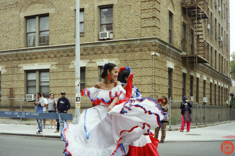
When you don’t know what to do with your colors, here’s one heck: Put your vibrancy and saturation to 100%. This will allow you to adjust your white balance and tint, and fix the image where it feels balanced. After that, you can reduce the vibrancy and saturation back to its normal shade.
Split Toning
Last but not least is split toning, a process where you add colors to shadows and highlights. In an image, you can add a yellow tone in the shadow but add a cold color in the highlights. This way, one gets a dynamic contrast, which will give your image depth and mood. A flat image can, thus, can be bought to life.
Get rid of the ads!
Did you enjoy reading this article as much as we enjoyed writing it? There's a way to support us and our reporting, getting ad-free navigation and more as a bonus. Subscribe to us for less than a coffee per month —just $3.99— or take advantage of our yearly subscription with a hefty discount for only $25.- An ad-free experience
- A free mystery box for Lightroom or Capture One
- All the books in our store
- 20% discount on Capture One
- 30% discount on Imalume Photo Theft Protection
- 20% off Herbs and Kettle Tea Company.
- 20% off your order from MPIX printing services.
- 5% off Viltrox Products via their eCommerce store.
- 10% off all film developing, printing and scanning services from Blue Moon Camera and Machine
- 15% off 7Artisans products: The lens and accessory maker is offering a sweet discount for Phoblographer's readers.