
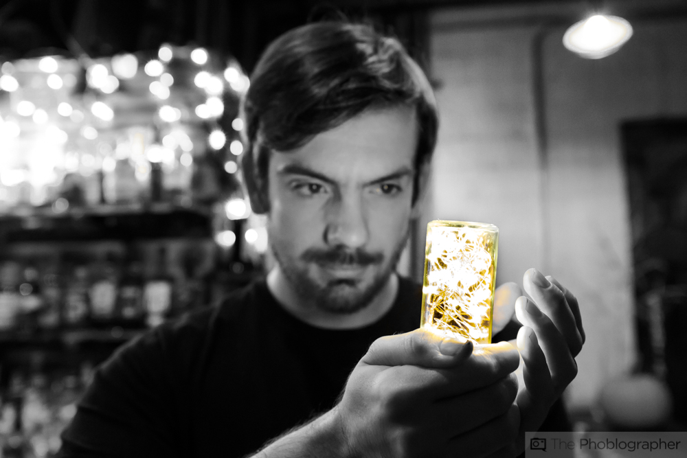
For many, many years photographers hated the spot color look. Spot color, for those of you who haven’t been into photography for more than maybe five years, is when a black and white photo is created but only a specific single color is kept. The problem is if that color was spread through the entire scene in some way or another, it wouldn’t be as effective. These days on Instagram, lots of photographers do it VERY effectively so much so that it’s a trend again. The technology and the artists have become better and typically use the color in the scene to help draw the viewer’s eyes into a specific part of the scene.
You probably haven’t seen a lot of it unless you’re really into the black and white photography scene. And because I run La Noir Image (which this month is focusing on landscapes), I’m very embedded into it. There are many schools of black and white thought. Some photographers embrace only film photos and want to print with nothing else except with a service like digital silver imaging to create the most pure black and white photos. Others embrace digital and all the tools that are allowed and provided for a photographer behind a screen. For the most part though, digital has mimicked analog and there hasn’t been a whole lot of really cool evolution. Now, the spot color trend is returning.
This method honestly began way back in the analog film days. What some photographers used to do with their black and white negatives is color over them. Sometimes you’d have full scenes colored in and other times you’d have only a bit of one. When digital photography came around, things changed.
It’s fascinating that a method so incredibly hated by photographers has suddenly returned. To be fair, it was originally billed as a feature useful for the consumer who purchased a camera and felt that they wanted to just have fun. It was available on every Canon PowerShot at one point and I remember absolutely hating the results and photographers in DPReview’s forums saying how terrible it was. The problem: the consumers using this feature didn’t have a creative vision and it was instead just applied to things like selfies and some pretty pedestrian photos overall. But artists with an actual creative vision for their photographs are doing it much better these days. However, these artists are also being incredibly specific about where the color is in the scene vs just letting the camera or app do it automatically.
Spot color can start with apps like Touch of Color on iOS, but keep in mind that the image also has to be very good–plus the composition needs to be effective too. I prefer to do it in Lightroom where I have a bit more manual fine tuning control.
Something I’ve talked about before is that black and white photography isn’t a crutch. Instead, it’s something that can help enhance a scene with bland color to begin with. But when you add in a bit of color, you’ll find a way to enhance the scene overall. I still stand by this statement overall, and now it’s evolving thanks to this new Instagram trend.
What will be incredible and very fascinating to see is how it will evolve to work out better with video and cinemagraphs. Indeed, it’s also a way for still photographers to keep the still image more interesting in a time when we’re seemingly being bombarded with 3D, VR, and 360 photography. In fact, a 360 photo with spot color would also be pretty radical!
So if you’re working on black and white photos, be sure to give the spot color trend a shot.