
When you look at portraiture today’s trends lend themselves to a few looks that really seem to stand out the most amongst all the rest: high contrast and low contrast. In the photography world dominated by looking at images of stuff and things on Instagram, contrast and clarity have become the most important tools to make an image look sharper and punchier–especially considering that it completely removes the ability to pixel peep.
Black and White
Black and white photography ends up stripping an image of its colors and reducing it to the very basics. The way that things are really differentiated is with tones, contrast and lighting. But it can make a scene look different accordingly.
High Contrast
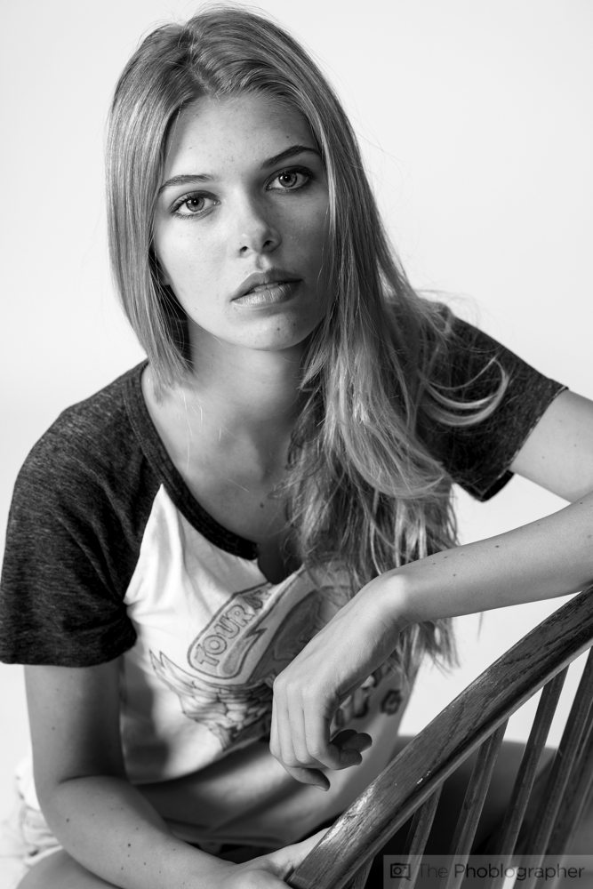
This photo is very high contrast. The blacks and whites are both deeper and so our eyes naturally ignore them and focus on all the tones in between to make something work from the scene. Things tend to pop out more than they should like the subject’s face for example. It almost seems surreal–and that’s part of the effect that high contrast does for black and white portraiture.
Perhaps this adds to its rise in recent years to make something stand our in a scene more overall.
Low Contrast
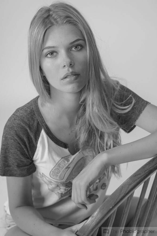
On the other hand, low contrast portraits seem to blend all the areas in. Less stands out at you overall and your eye looks more at the actual scene and composition to make sense of it. Unlike the strong contrast, it doesn’t add to depth of field effects to point your eyes directly to something.
However, with low contrast I’d strongly argue that the model’s features look softer and in that way more appealing to her overall face. Her lips and eyes aren’t popping directly out at you and for that reason you can also make a claim that it’s a much more humanizing scene. Part of all this has to do with overall softer shadows.
Color
Amongst the more artistic minded amongst us, color photography is very complicated. The specific placement of colors in a scene can draw the eyes to one direction or another–and this is a big reason why in portraiture many photographers tend to use less colors overall.
High Contrast
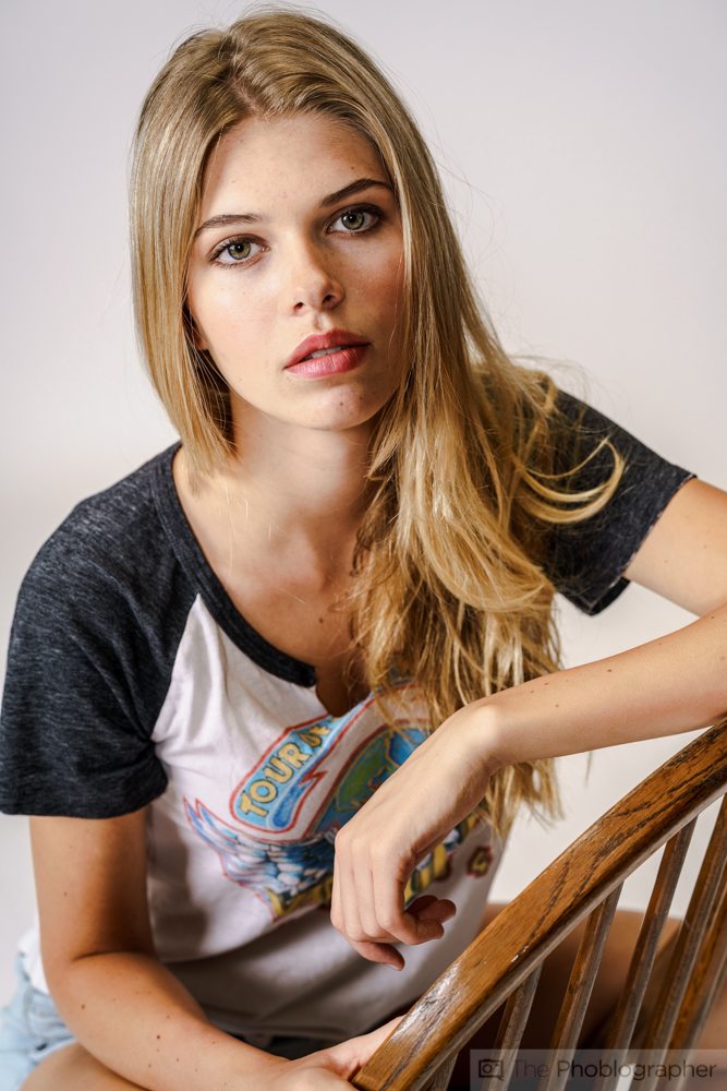
High contrast color is surely one way of doing lots of scenes. Combined with effective uses of color in a scene, it can really draw your eyes somewhere. In this scene, we’re drawn heavily to her eyes and lips. These are defined by deeper blacks and whites accordingly.
But you’d be amazed at just what’s possible with low contrast.
Low Contrast
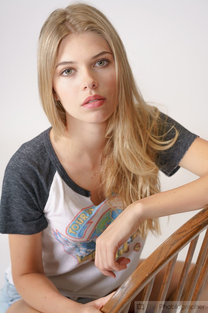
Low contrast takes away that extreme sharpness and makes the features softer again. Shadows and highlights aren’t popping out at us but it’s still strong enough to really have her eyes and mouth jut out at use because of the specific uses of color.
So how do you combine the best of both worlds?

In Adobe Lightroom, you can go into an image and selectively boost certain color channels. Here, we messed with the oranges, blues, greens and reds to pump them up and make them more saturated by less contrasty. This is the formula that film used for a while to make a scene really stand out. When it comes to color.
Through use of off-camera lighting, you’ll get that natural sharpness, but because your clients are most likely not going to pixel peep the image, all that matters is how the photo looks as a whole.
Overall this is the best bet. Sharpness is still there, the skin looks great, and the colors are being used heavily to really pop out at you.
Sharpness being applied afterward won’t really matter–contrast and clarity can but they’ll give you a different look.